
Designing a Homepage That Converts: From Viewer to Client

Your homepage is your first impression online, and honestly, you have roughly 60 seconds to turn a casual browser into a potential client. Gone are the days when a website could merely be a digital storefront; now, it needs to be more like welcoming someone into your living room.
Your homepage should be honest and inviting in such a clear and compelling way that people want to stay a while and learn more about what you have to offer.
Creating this level of warmth and invitation on a simple landing page or homepage can seem daunting, but it is entirely achievable with the right approach. By focusing on strategic layout and design, centering your viewer in the words you use and making sure you guide them in a clear way, you can transform your homepage into a powerful tool that converts viewers into loyal clients.
In this blog, I’ll share the essential elements of a high-converting yet authentic homepage for a personal-led business. We'll start with the strategic layout and design, move on to the importance of engaging and empathetic copy, and finish with the crucial role of effective calls to action.
I want you to have the knowledge and tools to create a homepage that not only attracts visitors but also converts them into clients, helping you grow your business with authenticity and impact.

Strategic Layout and Design
Strategic Layout and Design in simple terms are all about creating an intuitive path that leads the visitors from interest to action. The easiest way to do this is by seeing your homepage as a strategic roadmap or overview of your website, guiding visitors smoothly through the most important and convincing parts of booking your business. We can break this down into three major factors.
Highlight Key Parts of Your Website: Your homepage should obviously have navigation options visible and easy to find but as they scroll down you also want to give them a taste of the key pages they may be searching for. For most Service-based websites, these are the essentials for your homepage.
Your Services: Your homepage should be focused and clear on what you have to offer, from the visuals to the words and to the direct mention of your services. Linking to all the service pages you have.
About Me: Sharing Who you are in an abbreviated way and direct to your About Me page.
Testimonials: Share social proof to build trust.
Finish with a CTA: At the bottom of their scroll, make sure there is a direct action to either contact you or book now.
Feature Unique Selling Points: Your business will have its unique selling points, the positive features about working with you that people will be converted by. Similar to the example here, she shares two sections that highlight her USPs with clarity “When you choose to work with me” and “Everything you need to know”
More USPs you may want to feature if they are in alignment with your business…
The BEST of your portfolio and keep it updated for style, quality, and always culling for the best examples of your work (for artists and photographers)
Years of experience or years local to your area
The experience and what sets it apart from your competition
Engaging Design: You want them to learn about you and your brand just from the energy and look of each element.
Every choice says something about your business, and the choices you aren’t making in design could be turning people away.
Movement is very helpful for drawing the eye in your design. Color and intentional space also give the eyes space to rest while absorbing info.
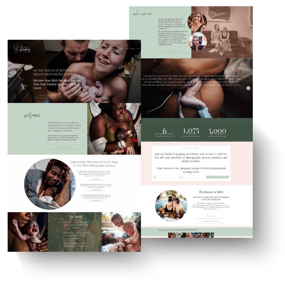
A great example of a strategic and engaging homepage | Birth Becomes You Designed by Hanna Hill Creative
Centering Your Viewer in the Copy
Next, we’re focusing on the heart of your website: the copy. The copy is essentially the strategic words you use to express you brand and describe your services. The magic of compelling copy lies in making the viewer the hero of the story.
This is especially true for birth workers, healers, and photographers, where the essence of your service is deeply personal and centered around the client experience.
Creating copy that centers on your viewer is an art form that blends empathy, clarity, and authenticity. It's about weaving together the unique parts of your brand with the needs and dreams of your ideal clients to forge a connection that’s both meaningful and converting.
Before writing for your homepage make sure you know:
What your clients NEED
What your clients WANT
What your clients FEAR or WORRY ABOUT
Why YOU are the solution and the best choice to meet all three of those things.
Now, let that discovery inform the way you entice people for your services, what testimonials you feature, and even how you introduce yourself and your unique selling points.

A great example of client-centered copy on the homepage | Lindsey Eden Birth Photography Designed by Hanna Hill Creative
Guide Them On What To Do Next
Every great homepage needs a clear, compelling call-to-action (CTA). Here are some tips for crafting an effective CTA:
Be Direct: Studies have shown that direct instructions like "Click Here" or "Contact Me" significantly boost inquiry rates. Within those first 60 seconds of capturing the visitor's attention, it’s crucial to be clear about the next steps.
Light Actions: Phrases like “learn more” or “explore” can be used throughout as secondary actions, but the final CTA of the page should be direct and the most important action for book services.
Make it Easy: Make this process straightforward by placing a contact form prominently on the page or linking directly to your contact page, removing barriers to taking that next step.
Know Your Goals: While the essence of a CTA is universal—directing potential clients on what to do next—not every website will leverage the same call-to-action. For many, the goal is to encourage inquiries or book calls.
For photographers, effective CTAs might include "Book a Session" or “Get in Touch” to guide potential clients to take the next step to booking.
Birth workers can benefit from CTAs like "Schedule a Free Consultation" or "Join Our Community," encouraging expectant parents to connect and receive support.
For those selling from a small shop on their website, CTAs such as "Shop Now" or "Explore Our Collection" can entice visitors to browse and make purchases, driving sales and engagement.
For more general service providers, effective CTAs could include "Get a Quote" or "Contact Us Today"

A great example of focused CTA on a homepage | The Mama Root Designed by Hanna Hill Creative
By implementing these strategies, you can transform your homepage into a powerful tool that not only welcomes visitors but also converts them into clients. And if you need a web designer to come in and help, I would LOVE to connect and help transform your home page into something people see and are just 100% ready to work with you!

Hey I’m Hanna!
Web Designer, Brand Curator, Social Media Supporter, Boy Mom, and lover of seeing other creative businesses flourish and succeed!
Blogs You May Want to Read Next


